使用 background-clip border-area 创建创意边框
你想用 CSS 轻松地从图像或渐变中创建边框吗?就像这样…

多年来,我们一直能够使用 border-image 创建边框——图像被切成九块,然后重新组合以单独构建盒子的角和边。现在有了 background-clip: border-area,我们可以将背景图像应用于边框。它可以简单地以一块的形式填充整个边框。
今天在 Safari 技术预览版和 Safari 18.2 测试版中,background-clip: border-area 已受支持。
一个基本示例演练
工作原理如下。首先,我们将在 HTML 中创建一个基本标题,并使用典型的 CSS 来设置标题和页面的样式。
<header>
  <h1>Woodworking</h1>
</header>

现在,让我们为 <header> 盒子添加边框。
header {
  border-width: 30px;
  border-style: solid;
}

接下来,我们将为盒子添加背景图像。
header {
  background-image: url("wooden-table.jpg");
  background-size: cover;
  background-origin: border-box;
}

通过应用 background-size: cover,我们告诉浏览器调整图像大小,使其填充整个盒子,同时保持其自然宽高比。它“覆盖”盒子,不留任何空白,必要时裁剪掉一个方向上多余的部分。
我们还必须记住应用 background-origin: border-box,使背景图像完全延伸到边框的外边缘,而不是只延伸到内边距框的边缘并重复。如果忘记这一步,我们将得到意想不到的错误结果。(有关更多信息,请参阅本文末尾的解释。)
现在,为了达到我们想要的效果,我们将做两件事——1) 使边框透明,以便我们能看到边框下方的背景图像;2) 将背景裁剪为只出现在边框定义的区域,而不出现在内边距或内容框内。
header {
  border-color: transparent;
  background-clip: border-area;
}

太棒了!我们用一张完整的图像创建了一个边框!让我们把所有实现这个效果的代码放在一起
header {
  border-width: 30px solid transparent;
  background-image: url("wooden-table.jpg");
  background-size: cover;
  background-origin: border-box;
  background-clip: border-area;
}
多种可能性
我们可以通过使用 背景属性 进一步控制背景的大小、重复和位置。并且我们可以使用 background-image 创建多种不同类型的背景——包括图像文件、线性渐变或径向渐变。
这也适用于任何类型的边框。通过 border-style 我们可以将边框类型更改为点线、虚线、双线或更多。当然,我们可以使用 border-width 更改粗细,并使用 border-radius 来圆角。我们可以在盒子的某些侧面定义边框——今天所有边框可能实现的功能都适用于此技术。
此外,由于能够在盒子中添加多个背景,您还可以为内容或内边距框添加背景,将背景裁剪到文本中等等。让我们通过更多示例深入探讨这些可能性。
插图的渐变边框
我们可以在插图上添加一个漂亮的边框,同时使用内边距在内容和边框之间添加一些额外空间。
<figure>
  <img src="illustration.png" alt="[include alt text]">
</figure>
让我们将渐变背景应用于 figure,并记住使用 background-origin: border-box 使背景延伸到边框后面。我们将添加一个 30 像素宽的透明边框。然后将背景裁剪到边框,创造出神奇的效果。

@supports (background-clip: border-area) {
  figure {
    background-image: linear-gradient(in hsl, #dc9323, #7f416a);
    background-origin: border-box;
    border: 30px solid transparent;
    background-clip: border-area;
    padding: 6px;
  }
}
我们可以将所有边框样式放入一个特性查询(Feature Query)中,以确保它们仅在浏览器支持 background-clip: border-area 时才应用。如果不支持,将没有边框。或者,如果需要,我们可以为不支持的浏览器提供实色边框。
@supports not (background-clip: border-area) {
  figure {
    border: 30px solid #a8363d;
    padding: 6px;
  }
}

这种图形设计功能今天可以很容易地作为渐进增强(progressive enhancement)应用——在支持的浏览器中生效,并为不支持的浏览器提供备用方案。
渐变按钮边框和文本
那么我们如何编写本文开头那个演示的代码呢?未来,它可能就是 background-clip: border-area 最受欢迎的用例。
边框使用上面描述的相同技术,填充了线性渐变背景“图像”。如果这就是我们想做的所有事情,我们将使用这段代码
button {
  border: 10px solid transparent;
  background-image: linear-gradient(to bottom right in hsl, green, purple);
  background-origin: border-box;
  background-clip: border-area;
}
但边框并不是唯一具有背景渐变的部分。文本也有。为了实现这一点,我们将在 button 上两次定义线性渐变背景——一次作为边框的背景,另一次作为文本的背景。我们将为 background-clip 定义两个值——一次告诉浏览器将第一个背景裁剪到 border-area,另一次将第二个背景裁剪到 text。
button {
  background-image: linear-gradient(to bottom right in hsl, green, purple),
                    linear-gradient(to bottom right in hsl, green, purple);
  background-clip:  border-area,
                    text;
}
我们还需要将文本 color 设置为透明,就像我们将边框颜色设置为透明一样——使文本和边框都“不可见”,以便它们的背景能够透出。
这是所有代码整合在一起的效果
button {
  color: transparent;
  border: 10px solid transparent;
  border-radius: 100px;
  background-image:  linear-gradient(to bottom right in hsl, green, purple),
                     linear-gradient(to bottom right in hsl, green, purple);
  background-origin: border-box;
  background-clip:   border-area,
                     text;
}
您也可以查看完整演示,深入了解我们如何使用特性查询(Feature Queries)来为不支持的浏览器构建备用方案。
background-clip: text
哦,你不知道可以使用 background-clip 用背景图像或渐变填充文本吗?这项功能于 2008 年由 Apple 的工程师首次发明并在 Safari 3.2 中推出(后来在 Blink 中派生)。在 CSS 工作组将其草拟后,它于 2010 年在 Safari 5 中取消前缀,2016 年添加到 Firefox,2023 年 12 月在 Chrome/Edge 120 中取消前缀,2024 年 5 月在三星互联网中取消前缀。

原理完全相同。在盒子上添加背景。将该背景裁剪为仅填充文本所在区域。然后通过将文本本身设置为透明,使背景可见。
由于仍然有浏览器不支持无前缀版本,因此务必包含有前缀版本和/或将此代码包装在特性查询中——否则,如果应用了 color: transparent 但不支持 background-clip: text,文本将完全不可见。
@supports (background-clip: text) or (-webkit-background-clip: text) {
  h1 {
    background-image: url('leaves.png');
    background-size: cover;
    background-position: center;
    -webkit-background-clip: text; /* to support Blink browsers */
    background-clip: text;
    color: transparent;
  }
}
但是,只要小心使用,您可以利用 background-clip: text 完成令人惊叹的事情。
未来的变化
顺便说一句,CSS 工作组最近决定允许同时将单个背景层裁剪到边框和文本(通过同时指定两个裁剪值,例如 border-area text),因此将来您将无需两次声明它们的共享背景。
上周,CSS 工作组决定在 background 简写属性中使用 background-clip: border-area 时,自动将 background-origin 默认为 border-box。
这两个变化意味着在未来,您将无需像这样编写
button {
  background-image:  linear-gradient(to bottom right in hsl, green, purple),
                     linear-gradient(to bottom right in hsl, green, purple);
  background-origin: border-box;
  background-clip:   border-area,
                     text;
}
您将能够将所有背景值组合到一个规则中,就像这样。请注意,您无需费心处理 background-origin。
button {
  background: border-area text linear-gradient(to bottom right in hsl, green, purple);
}
CSSWG 还在讨论是否将 border-color 的初始值不再总是 currentColor,而是检测是否存在 background-clip: border-area,在这种情况下,自动将 color 设置为 transparent。这将避免您忘记这样做。
这些更改都不会在 Safari 18.2 测试版中推出。请关注 Safari 技术预览版发布说明并进行测试。同时,声明 color 和 background-origin 的预期结果,并为多个裁剪多次指定相同的背景,是确保您所需结果的方法。
警告标志
让我们看看如果只在盒子的两侧而不是四边都加上边框,我们能做出什么。渐变可以有硬停止,允许我们制作条纹…
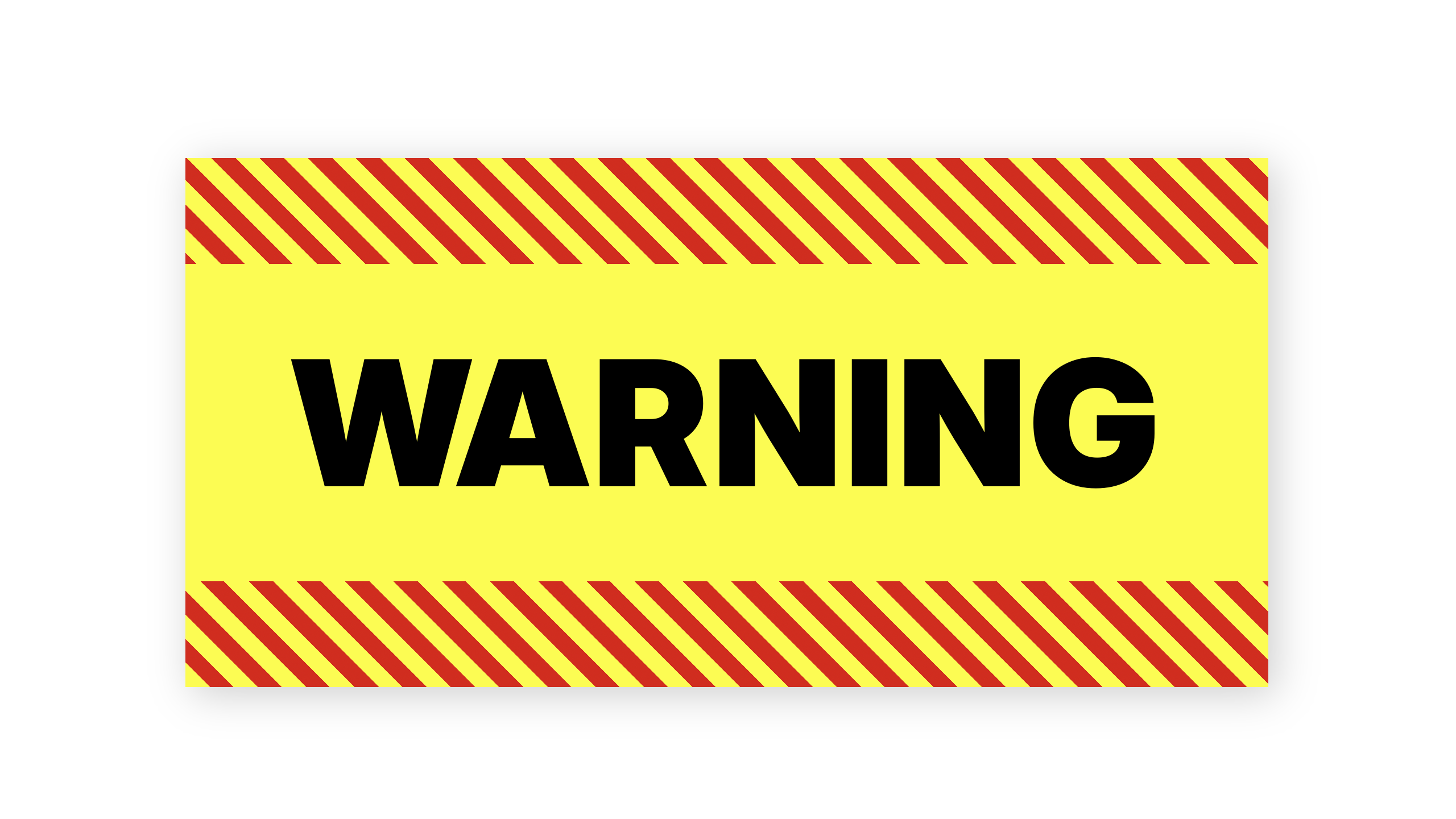
.stripes {
  border: 0px solid transparent;
  border-block-width: 0.5lh;
  background-clip: border-area, border-box;
  background-image:
    repeating-linear-gradient(
      45deg,
      transparent,
      transparent 15px,
      red 15px,
      red 30px),
      none;
  background-origin: border-box;
}
带双摄影边框的照片
让我们用一张照片作为边框的背景——与内容相同的图像,以及内边距和双边框。
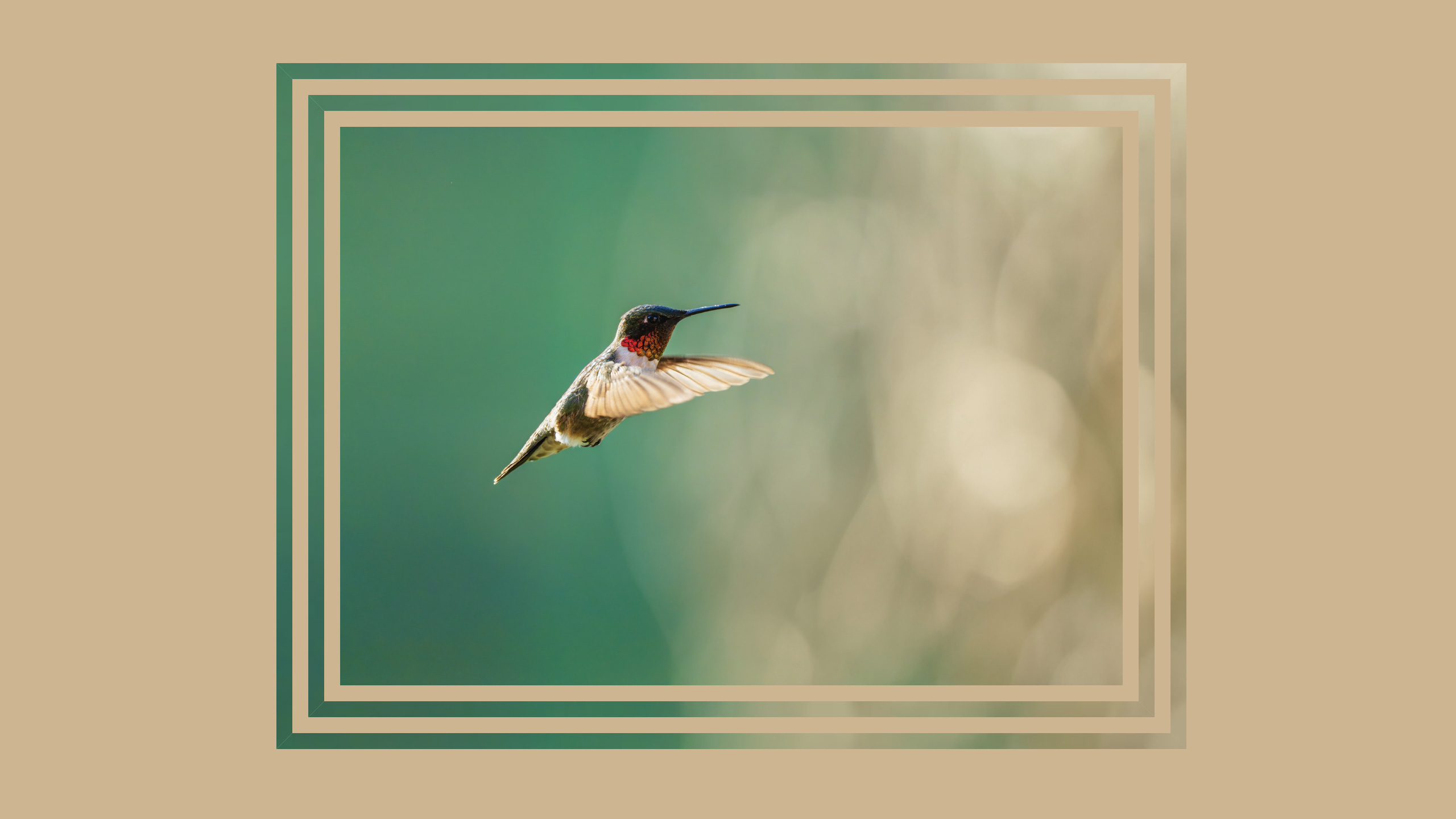
figure {
  border: 21px double transparent;
  background-clip: border-area;
  background-origin: border-box;
  background-size: cover;
  background-image: url('bird.jxl');
}
使用边框作为环来显示数据
我们还可以使用圆形盒子(也称为圆形)上的边框来创建进度环。带有硬停止的锥形渐变可以说明已经取得了多少进展。

<figure style="--percent:84%">
  Reached <span>8,426</span> steps
</figure>
@property --start {
  syntax: "<angle>";
  inherits: false;
  initial-value: 0deg;
}
figure {
  aspect-ratio: 1;
  border-radius: 50%;
  border: 5rem solid transparent;
  background-image: conic-gradient(from var(--start),
                    lightseagreen 0 var(--percent),
                    ghostwhite var(--percent) 100%);
  background-origin: border-box;
  background-clip: border-area;
}
您可以在 CodePen 上查看完整演示,以及所有演示。
而且,如果您愿意,可以尝试动画化圆形边框,使其动态加载。或者制作类似的东西,带动画,作为加载图形。
background-origin: padding-box 与 border-box
前面我们提到了记住包含 background-origin: border-box 的重要性。为什么?发生了什么?
默认情况下,background-origin: padding-box 使背景延伸以覆盖内容及其内边距,而不是边框所在的区域。然后它会在边框下方沿每个方向重复背景。您可能很少注意到,因为当边框是实心时,您看不到它后面的背景。
让我们看看当边框是虚线时这种动态效果。

背景“随机”出现完全不同的颜色,这可能看起来很神秘。但实际上,这是有道理的。背景左边是绿色,右边是紫色。而且它正在重复。让我们把边框设置为透明,这样重复效果会更清晰

如果你喜欢这种效果,那就太好了!但很可能这不是你想要的效果。当我们把 background-origin 改为 border-box 时,背景会从边框盒的边缘延伸到边缘。然后我们就可以使用 background-clip: border-area 来创建我们想要的效果了。
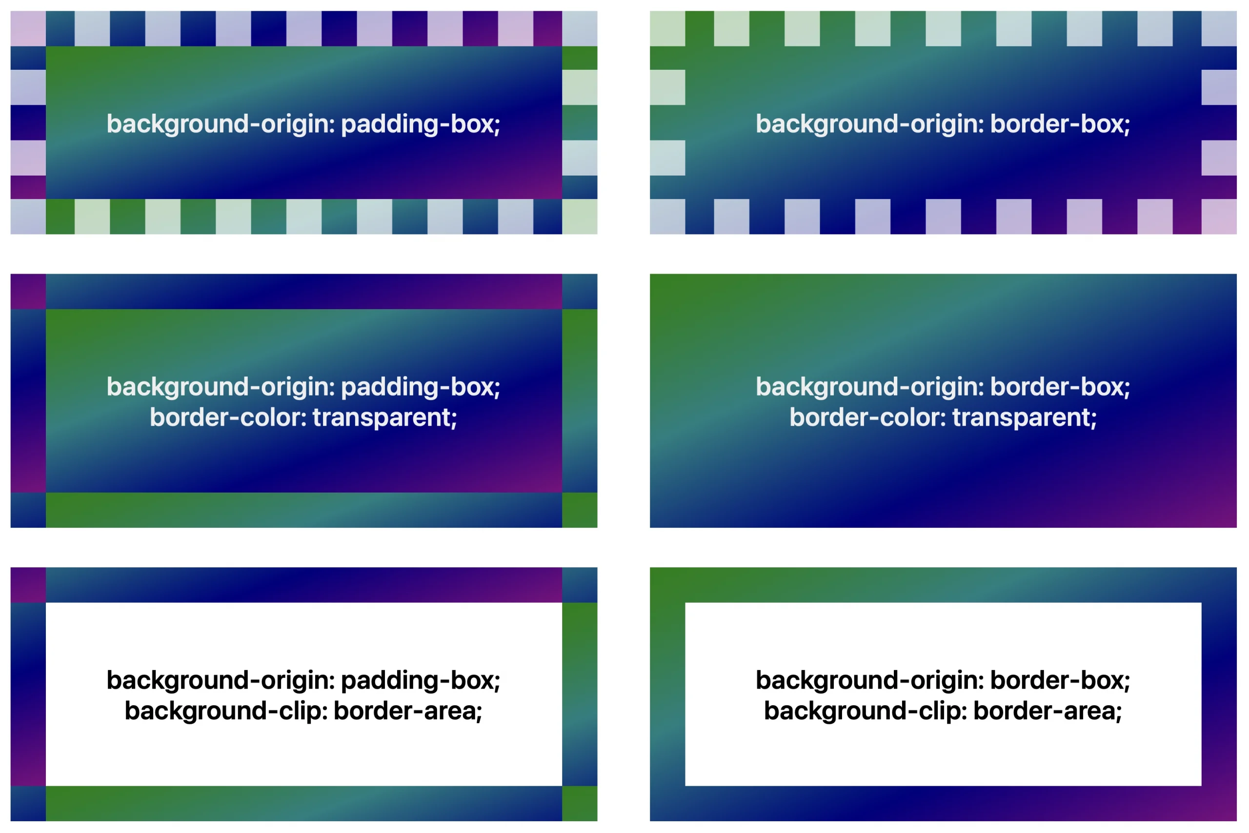
可以说,默认值本应始终是 background-origin: border-box ——特别是考虑到 background-repeat 的默认值是 repeat,这与 background-origin: padding-box 结合时会导致意想不到的视觉模式。也许这是 CSSWG 错误列表中需要添加的另一项。同时,声明 * { background-origin: border-box } 是通用重置样式表可以为每个站点提供的更改……尽管这只部分有用,因为无论何时您使用 background 简写属性,background-origin 都会被重置为其默认值。
底线——如果您正在使用 background-clip: border-area,并且对发生的事情感到惊讶和困惑,您可能需要应用 background-origin: border-box。
总结
CSS 中简单的效果,比如使用 background-clip,真的可以帮助你创建一个独特地代表项目本身的网站。
您可以在 CodePen 上一处查看所有演示。在Safari 技术预览版或 Safari 18.2 测试版中尝试它们。
你有什么想法?你会用这个功能创造什么?在 Bluesky 上通过 @jensimmons.bsky.com 或在 Mastodon 上通过 @jensimmons@front-end.social 告诉我们。我们迫不及待地想看看你的作品。